Friday, March 29, 2013

Tia Pakhi

Kantha Embroidery and beautiful colours,that is what got interested  me in Tia Pakhi.I love these little stitches called Kantha. Kantha stitiches where there from time immemorial,nowadays designers and craftpersons reinvent new designs with age old craft forms.

It was to my surprise that they had one of their exhibtions in New Delhi,in one of the beautiful villages in one of the beautiful surroundings of Rose,Hauzkhas. The exhibition seemed quite natural.By the time I reached it was the last day of the exhibition and it was late evening .So photographing the beauties in daylight seemed quite difficult for me so that I had to shoot in the dark.Tia Pakhi has also some brilliantly Indianised shoot for their products.

Tia pakhi cushions made my spring brighter and wonderful.see them in the last post.


                  As the sun sets and its time for my images which i took in the low light..The lamps kept just blew my mind.lamps glowing and the reflections made the ambience richer and brighter.I was fortunate to have been there at that time.


Images from 1 to 8 are copyrighted to Tia PAkhi
9-17 are copyrighted to LAkshmi Arvind
please do not copy nor save images

Wednesday, March 27, 2013

TOO WARM

CRAVING COOL....


via


Looking through Traditional Home and House Beautiful magazines this weekend, I was struck by the 'cool' palette nearly all the rooms were sporting on their walls.  From the barest hint of cool beige to light grays and deeper hues of blue gray, all were in the cooler palette.  That is not to say that the rooms were cold, or even

Read more »

Tuesday, March 26, 2013

BEST GRAY FOR A SMALL DARK ROOM


 GIVE ME A GRAY.....


Gray.  It's a popular color in design, and not going away anytime soon.  In rooms filled with light, high ceilings, lots of white wood trim - it's beautiful and fresh.  But what about a small room, with low ceilings?  Can gray work here?

Read more »

KEEP THE HOME FIRES BURNING

COLOR FOR NATURAL STONE FIREPLACE


House and Home


IN EVERY HOME there are elements we can't change - at least not right away.  There are things we need to live with - maybe its a previous owners stone or tile selections, or wood cabinet or floor colors,

Read more »

LIGHTEN UP!


WELCOME SPRING


The Foo Dog Ate My Homework


Blue and White has always been a favorite combination.
Add a little greenery, and it feels like Spring
A seagrass rug brings it down a notch from being too formal
Livable, fresh, crisp, clean, light
A classic.


Read more »

Sunday, March 24, 2013

Architectural Digest Home Design Show & My Beach House Update

Moonischco
Been so busy these last few months but so excited to get back to blogging and let you know all about some new trends that I have been tracking.  Just back from the Architectural Digest Home Design Show in New York on Thursday – what a great show!  It’s fantastic to see AD showcase new, small boutique companies and emerging artists!
AD SHow
We saw some really awesome products. One thing we saw a lot of was wood, wood and more wood.  Wood used as wall applications, beautiful floors designs, cabinets, etc. We saw a lot of barn wood and repurposed old wood, both stained, painted and distressed.  This was very interesting to me as I have just used 100 year old barn wood in my son’s room at the beach house (see below). One of my favorite new products that caught my eye is from a company called Moonish. 
moonish-011113-ny-620
These are marine grade plywood 6x6 tiles that are sold by the square foot. They have four magnetic backing tabs. You apply a receiving magnet to the wall and just stick the tiles on! They are held magnetically. Get tired of them or need a change? Simply lift off and voilà no more tiles. These are great for apartment dwellers, as well as those of you who move around and may want to take these lovely beauties with you.  For the DIY crowd I thought we could do so much with them – back an old cabinet, make a pretty mirror – check out Moonish tiles HERE
wud_1203_Salem_027
We saw lots of Mid Century furniture styles and lines; and some great new artists creating lovely contemporary pieces. I adored the lines and the finishes from WUD Furniture Design.  Here are some of their custom built ins as seen above and below. 
wud_1204_85N3rd_130
Their tables were beautiful but so hard to photograph, best to go to their website to see them. But what was most impressive was their furniture tops.
Wud4-151_HighRes
They use copper, zinc and rolled steel. They encase it in a hard resin, so it is impervious to scratching and stains. And if you think the resin makes it plastic looking, think again. These tops have an incredible true patina which I had difficulty photographing. Check out WUD Furniture HERE.
Oborain2
Also saw many companies trying to bring the luxury of the indoors – outside.  The West Coast is famously successful at creating gorgeous outdoor living spaces, but here on the East Coast our climate is not as forgiving. I just loved this well constructed, bamboo and cedar pre fab outdoor shower.  Made by a small Massachusetts company called OboRain, it will withstand the New England winters.  It comes shipped flat packed and is easily assembled. The design was minimalist and beautiful. You can see many other styles at OboRain HERE.
SUn Valley
Also discovered a “new to me” hardware manufacturer, Sun Valley Bronze.  Similar to Rocky Mountain Hardware, but with exquisite patinas and styles both for the “mountain” and the “city”.
Sun-Valley-Bevel-Entyset-sm

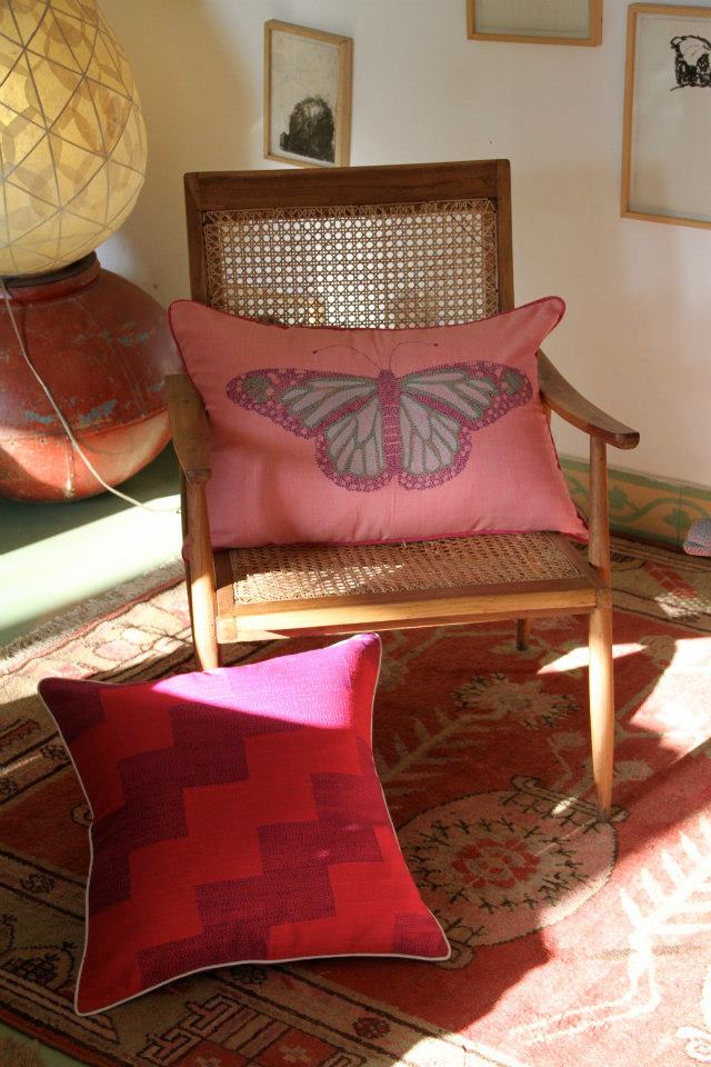
This is an example of their beautiful finishes, but do check out their website to see some extraordinary products – Sun Valley Bronze HERE
Now on to the Beach House… It has been a busy few months. We have been re- plastering almost every wall and adding tons of period style trim work and beadboard through out the entire house.  We also replaced several windows, which helped expand the ocean views. We also changed out a slider to windows, which helped enhance and correct the flow of the interior.
Beach exterior Before 
Here is a Before photo of the five unit contemporary window that was installed in the front of the house several years ago. I felt it distracted from the period style of the house.
Beach exterior after
And here is the After – still waiting to finish the outside trim work (will it ever stop snowing here?!)  Notice the new windows are 6 over 1 (mullions) and more appropriate in keeping with the 1920’s shingle style.
Beach Hallway Before
Another peek - Here is the upstairs hallway before we added all new trim work and detailing. The plaster, though not really visible in this photo was in need of repair. Notice the bead molding that runs along entire ceiling length on the right.
Beach Hallway AFTER
Here is the After - New plaster was applied to repair and highlight the beautiful crisp angles of the space.   Beadboard and trim were added to accentuate the great architecture and visually bring your eye up to create the illusion of a higher ceiling.  The Farrow and Ball paints are stunning and reflect the light beautifully.  The trim is Pointing and the walls and ceiling are Borrowed Light.  Floors still need to be refinished and new lighting fixtures need to be installed, but we are getting close.
Beach Bedroom Before
Finally here is a peek at the new wall treatment in my son’s room, above is the Before photo.
Barn wood Beach House
  100 year old barn board from Vermont was added to two walls and the other two walls will be painted a driftwood gray. The wood adds the most awesome back drop!   Keep tuned in because I will be enhancing the wall with a “really cool” (according to my son)  treatment.  It’s going to be great! I will post about it very soon.
I am just excited to be back to blogging.  Been missing you all and now that things are slowing down to a more manageable pace we can all reconnect!! Hope you have been doing well and I would love to hear from you!  Have a great weekend!!! 
xoxo Gina
(all content and photos property of Willow Décor and not to be used with out permission)

Wednesday, March 20, 2013

MAKE ME LOVE MY HOME


DESPERATE SEARCH...


The Bastille, Paris

CBID Design


I recently joined the ranks of they who love Paris.  It was inevitable, really.  Everyone loves Paris.  I liked the people, too.  I like that they look you in the eye as you pass them on the street.  (Londoners are discreetly aloof.)  I like the wide boulevards and the Housmanian architecture, the elaborate monuments and expansive museums.  I love the mix of old and new.  It is beautiful, and fun - even in a wheelchair, in the freezing cold


Read more »

LOOKING FOR A WARM GRAY


STILL LOVING GRAY....


via

WARM Gray?  It sounds like an oximoron.  There is the stereotype gray - that color we made by adding white to black in grade school.  Some people feel its a little boring... or depressing.... or dull...  I think it depends on how you use it, but for those of you who think gray is all the negative adjectives - meet WARM gray.  What?, you say.  Yes, add a little brown, or a little violet, or warm green as an undertone and you have an amazing gray that makes all those nasty old adjectives hide their heads in shame.... WARM.  GRAY.  Its a good thing.

Read more »

EXPLORING COLOR: NEUTRALS RULE....


EXPLORING PAINT COLOR:  BLUES AND NEUTRALS


Nature is amazing.  It is a color magician, putting colors together with expert eye.  I love the collection of eggs above for that very reason.  Speckled gray, cream, beige, brown and that perfect color - robins egg blue.   Now, if I could only find paint in that color .... Oh, wait... I can!

Read more »

Tuesday, March 19, 2013

REBIRTH


Keep Calm and Carry On .... turned out to be good advice.  Our first day in London I injured my knee.  The question became: stay there injured or go home...?  We applied ice packs, Advil, and anti-inflammatory medication - and prayer - and decided to stay.  We rented a wheelchair and changed a few plans.  My DH was amazing - pushing me all around London, which is not that wheelchair friendly and was definitely an adventure.  It could have been a disaster - but the group we were with was amazing, DH was amazing, and how can London NOT be amazing?  Even in the snow.  In a wheelchair.  


Read more »

Monday, March 18, 2013

And the Spring comes up slowly this way

The Spring is already at home.It paints my home with flowers,love and laughter.The gentle breeze that flows in,the warm sun that creates magic in some corners of the home.Spring is when life is  alive in everything..Christina Rosetti

I cannot imagine a day without flowers,spring is not an exception either..


an evening in spring
some serious reading happened

an old saree made into a rajai...a spring effect

all pinks together

yes its pot of tea

gladioli buds..yellows together

its all together


upside down


all in one frame


greens and whites

the old day bed is beautiful,its old and its been given a new life at home

my mornings are like this..flowers,books and the magical light
  
flowers are there in every corner of our home..the fragrance at home ..


all ideas,images :Lakshmi Arvind
please ask permission if you want to use these images.all images are copyrighted..dont steal nor copy images form the site..